


Seven Stars Lake Identity
I’m working on a new international identity for the Seven Stars Lake.The Seven-star Lake Ecological Tourist Attraction lies in the Kubuqi Desert (kù bù qí shā mò 库布其沙漠) in Hangjin Banne (háng jǐng qí 杭锦旗), which is a tourist attraction for holiday, featuring mainly on its sand resources and lakes in sand, with its construction invested by Elion Group. It looks like that:
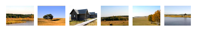
It covers an area of 8.89 km2, with the water coverage 1.15 km2, reed marsh land 0.1 km2 and grassland 3.8 km2. It got named “seven-star” as there are seven lakes in the form of the Big Dipper. Thus there comes the saying “Big Dipper in the Sky and Seven-star Lake on the Earth”. The emblem / letter of the area is K. After many studies here the first proposals:
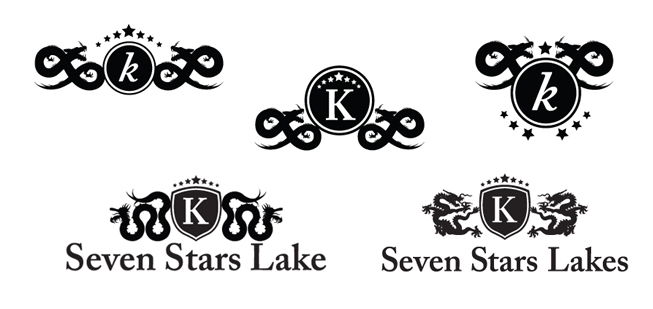
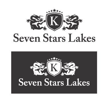
logotype is a mix of oriental and occidental signs, in order to give an international concept to the area. The dragons have seven rounded part, over the shield there are seven stars and the k is the main part of the emblem. Working in this new identity I also found out that the chinese dragon looks like a combination of many animals. For the Chinese people, Dragons were described visually as a composite of parts from nine animals: The horns of a deer; the head of a camel; the eyes of a devil; the neck of a snake; the abdomen of a large cockle; the scales of a carp; the claws of an eagle; the paws of a tiger; and the ears of an ox. Finally here the chosen logo:
Seven Stars Lake Identity